
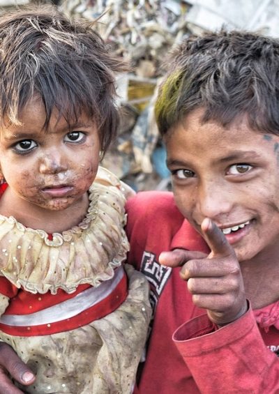
In Charts: Global Poverty
A collection of charts, maps and graphs exploring global poverty, those affected and the challenges they face.
As the year 2018 draws to a close, it is a good time to reflect on one of humanity’s greatest challenges: Global poverty.
Global poverty is measured by certain metrics, such as the Multidimensional Poverty Index (MPI) and the Global Hunger Index (GHI).
While great strides have been made in reducing the scourge, hundreds of millions of people still live in extreme poverty – facing all of its associated hardships.
Below is a collection of charts, maps and graphs exploring global poverty, those affected and the challenges they face.
To go deeper, browse The Globalist’s Poverty article collection by clicking here


