
In Charts: The Afghanistan War
A collection of charts, maps and graphs exploring the longest war is U.S. history.
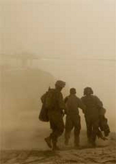
U.S. troops in Afghanistan (Credit: Artur Shvartsberg-U.S. Department of Defense)
The war in Afghanistan has been going on for 18 years – the longest war in U.S. history.
Below is a collection of charts, maps and graphs exploring the conflict, from its beginning in 2001 following the 9/11 terrorist attacks to where we are now.
Also browse The Globalist’s Afghanistan article collection by clicking here.


